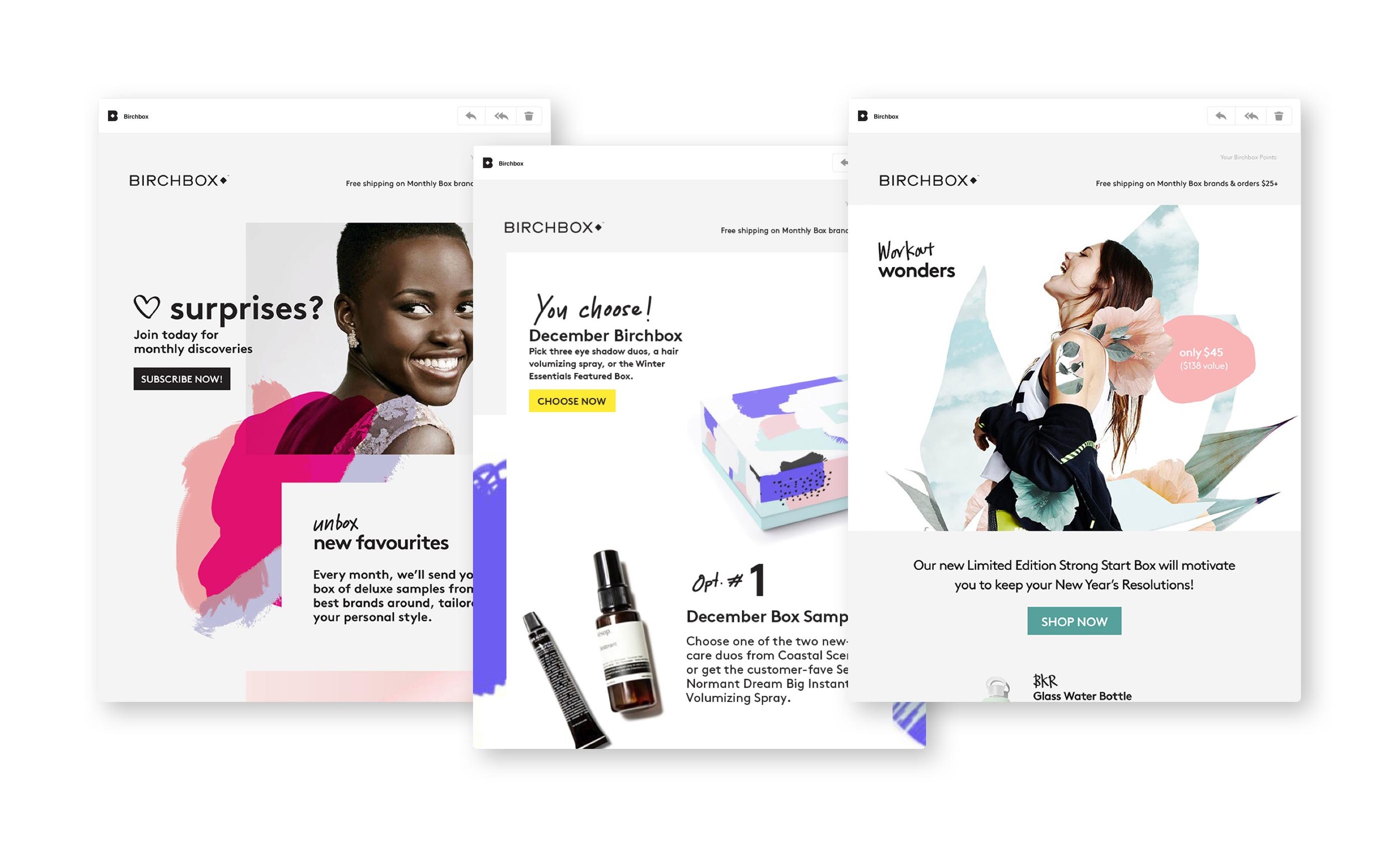
Birchbox Identity Rebrand
agency: Siegel + Gale
Creative Director: Kate Hilliard
Design Director: Jonathan Field
🔹
CONTEXT
Birchbox was losing customers in a category that they completely redefined & dominated when they launched in 2010.
CHALLENGES
They needed to reach beyond their loyal customer base to stay on top of the fierce competition by connecting with a bigger audience.
OBJECTIVE
Develop a visual identity system built on design cues that focus on “the moments before perfection” help tap into a younger audience.
APPROACH
Design worked in collaboration with Brand Strategy to tap into the insight that the majority of women (80%) need beauty to feel ‘fun’ and perfection is not idolized.
In order to create a feeling of “imperfect polish,” we created a system of graphic elements in the spirit of smudges, doodles and outtakes and introduced the voice of the “best friend beauty editor” (inspired by the founder) which set the entire tone, look & feel for the rebrand.
RESULTS
HOW: Promotions and Marketing Design Awards — Merit, Visual Identity Redesign
W3 Awards — Silver, Brand Strategy


